jozue

Brico Dépôt

  • Branding
  • Art Direction
  • Graphic design

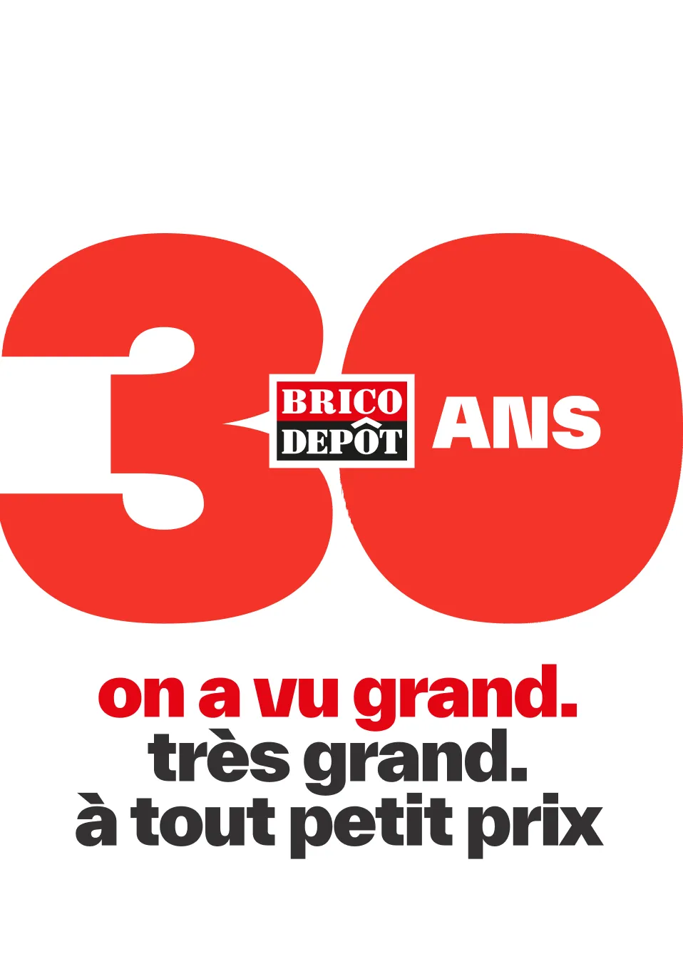
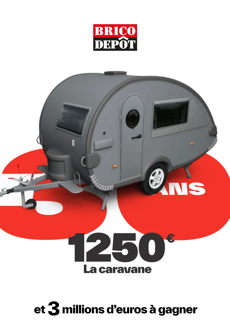
A new visual identity for the brand platform "See bigger for your projects". Pitch won.

new low cost

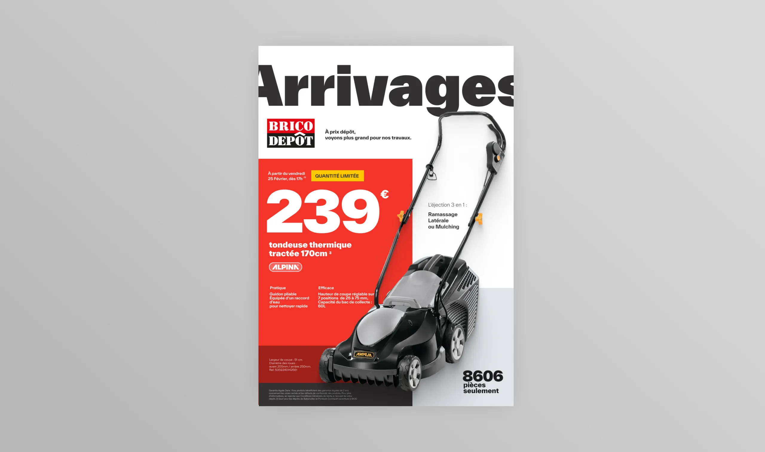
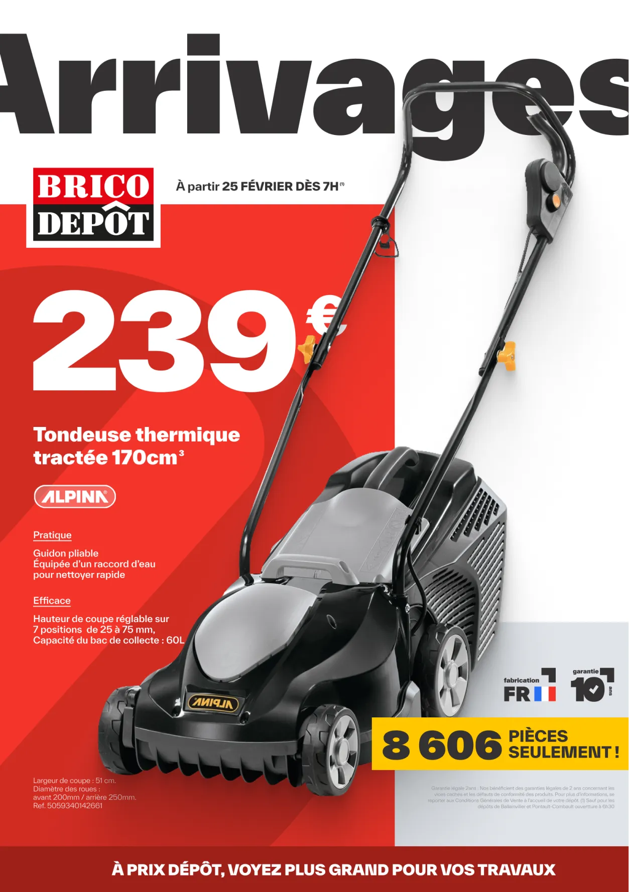
Arrivages leaflet cover with a lawnmower at €239, set on a grey background, Brico Dépôt identity redesign

Out of a brand that looked like a building site, into something calmer, with an architect's lines. The anchor was already there: the ô in Dépôt, the ô of surprise at the price. Low prices should show on the price tag, not in a cheap-looking brand.

Building the identity
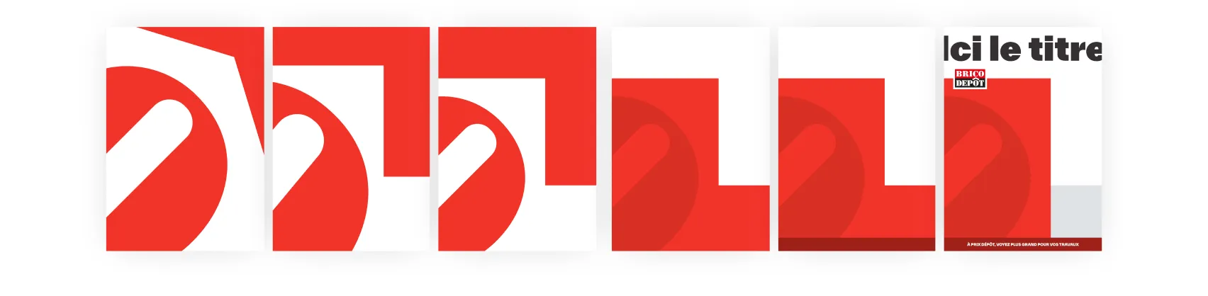
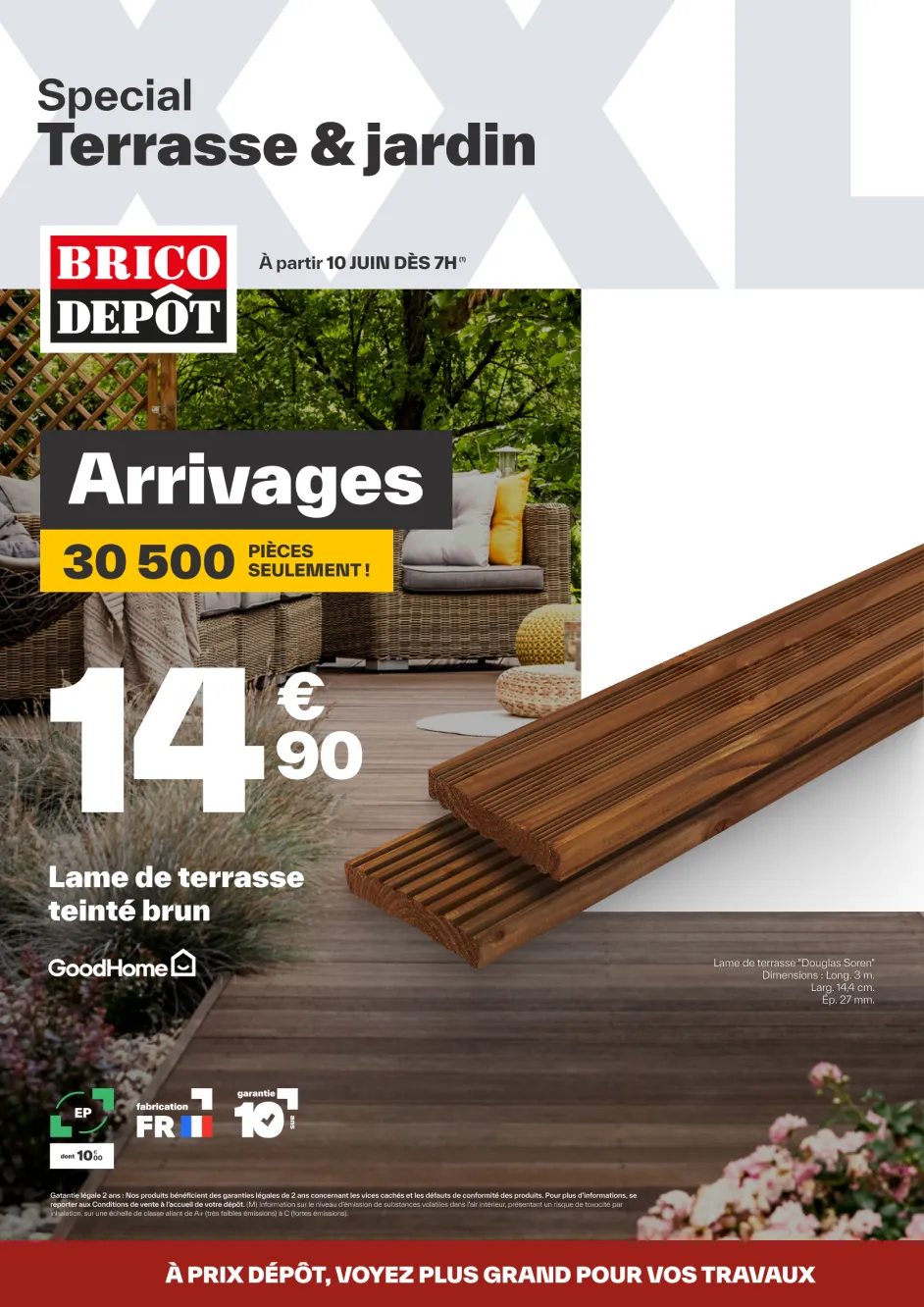
Strip of red and white frames showing how the ô of the logo becomes a graphic device, Brico Dépôt identity

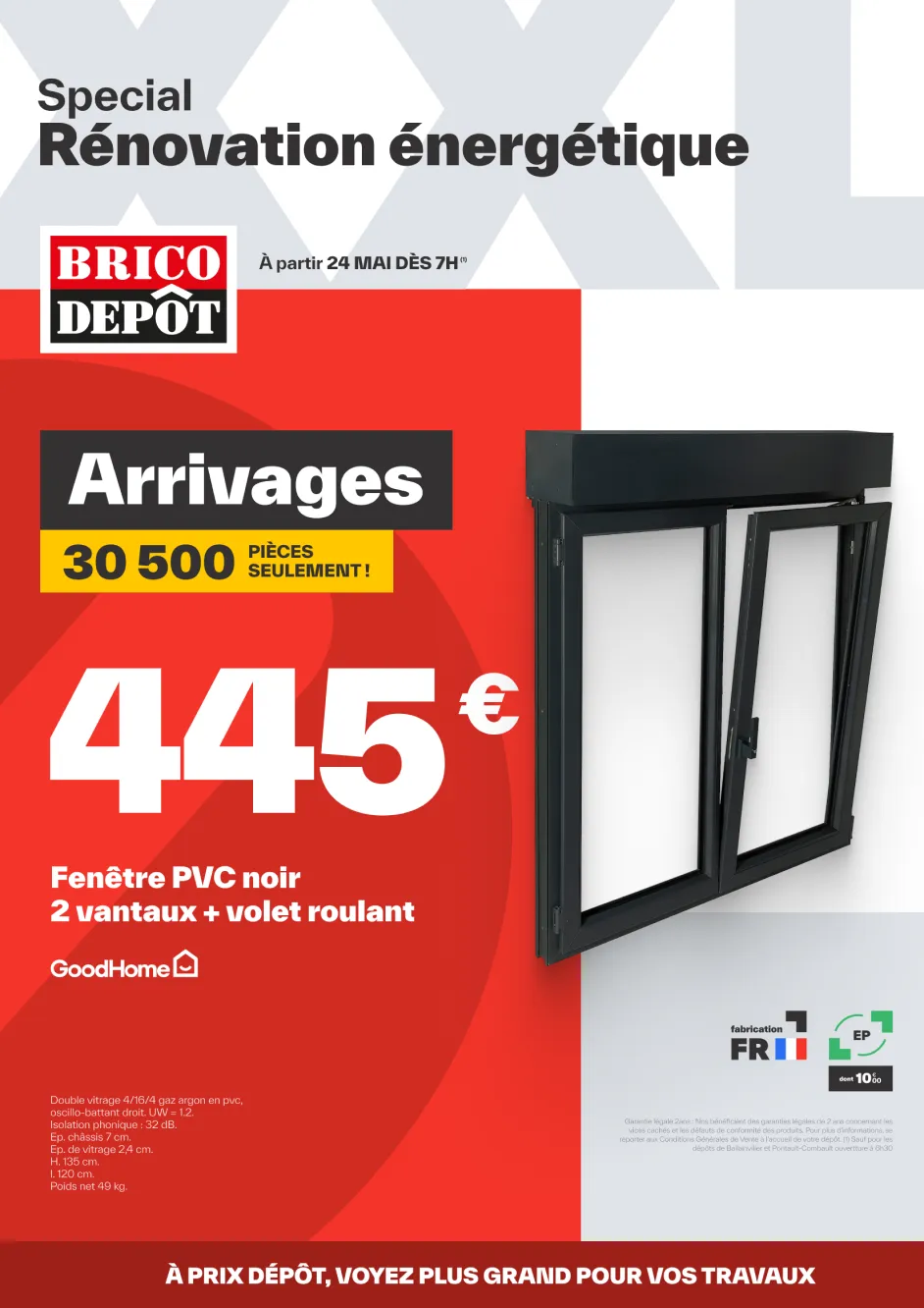
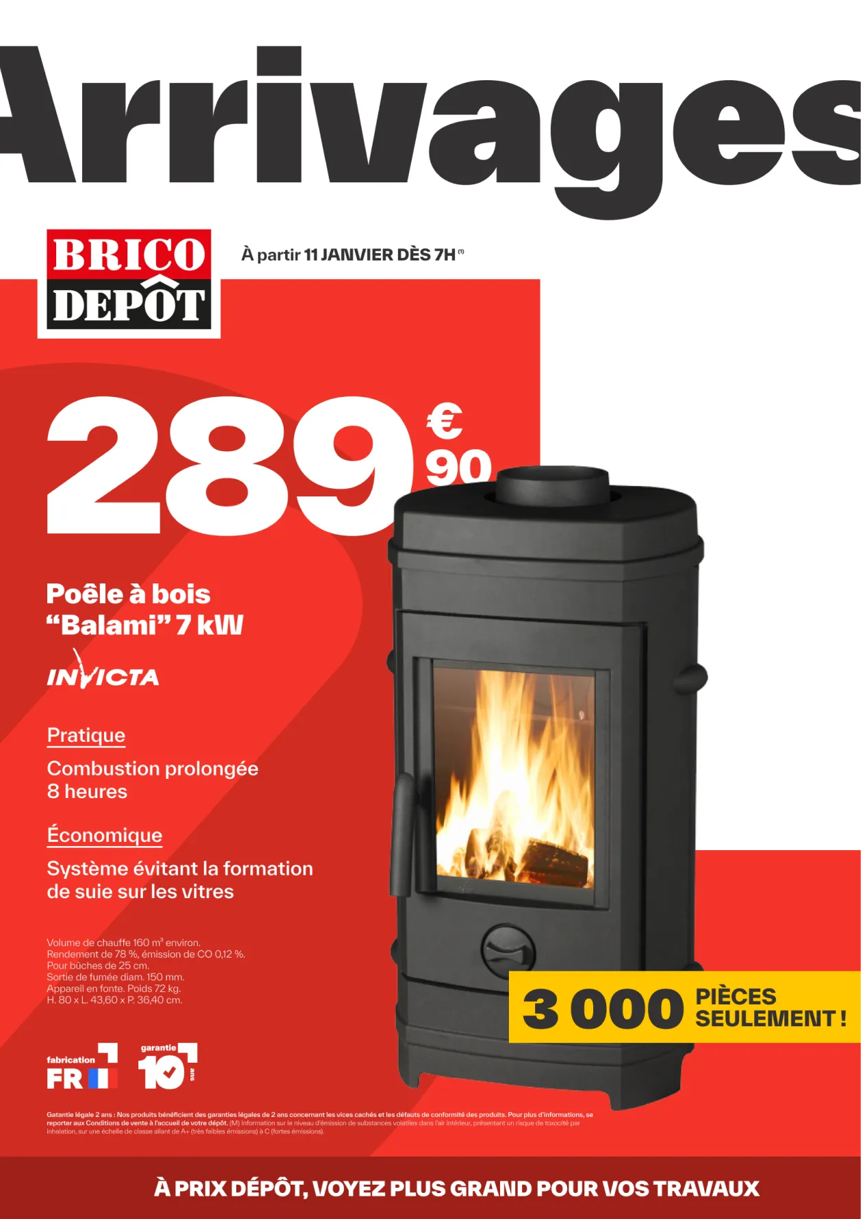
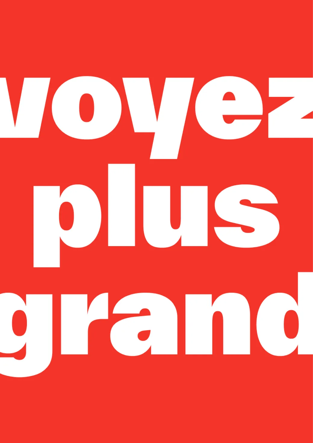
So big the
headline
won't fit on
the page.
Rouge 200

#9d201a

Rouge 100

#f33429

Jaune

#ffc700

Gris

#e0e4e8

Gris projection

#333131

Magazine covers
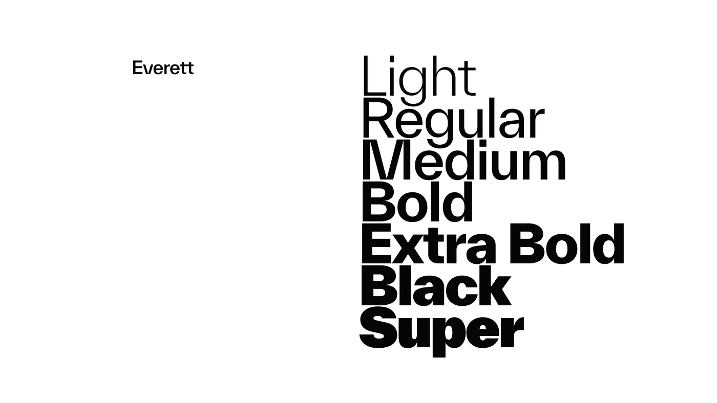
Everett typeface specimen, weights from Light to Super, the type family of the new Brico Dépôt identity

Credits

Agency

AustralieGAD

Role

Creative director
Art director
Brand designer

More works

FilmmakingArt DirectionPhotographyGraphic design Graille sur le rail
BrandingCopywritingGraphic design Mijote
Art DirectionCampaignCopywritingGraphic design Arte

Got a project ?

jozue

let's talk

I'm available for freelance work, in-house or remote

Get in touch